We may not have any comics to review just yet, but we've got covers. Three months worth of covers. Some of them are not so great, but some of them are awesome, and they're the ones I'm here to talk about today.
First up, an honorable mention, because my favorite cover of the DCnU is not actually a cover.
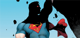
For whatever reason, DC decided not to use Rags Morales' update of the classic Action Comics #1 cover for the series' second first issue. In spite of that, it's become a symbol of the reboot, and I really hope it's released as a variant. This image will someday hang on my bedroom wall. Now, onto the list!
10. Batman #3, by Greg Capullo
I have to admit that I wasn't a huge fan of the first two solicited Batman covers. Greg Capullo's a talented artist, to be sure, but the covers didn't seem to fit Snyder's style and made me miss the beautiful covers that Jock had created for Snyder's run on Detective Comics. Seeing this cover, however, put all my fears to rest. It's eyecatching and manages to showcase an action-packed pose while still remaining pretty minimalistic. When I look from Batman cover to Batman cover, I can see Capullo's Batman been drawn deeper and deeper into a strange and different world, and I really like the idea in that. This is a Batman comic and shouldn't have any trouble drawing in new readers, but a great cover like this shouldn't hurt.
9. Red Hood and the Outlaws #1, by Kenneth Rocafort
I'm a huge fan of Rocafort's art, and I've really enjoyed all the covers we've seen from him so far, even the fanservice laden cover for issue number 2. What really pushed this one to the top for me was how well it sold the overall feel of the book. Anyone looking at this cover and the book's title should be able to get a general feel for what this comic is supposed to be. That's something that any number one issue should be trying to pull off, and I hope it garners this series some readers. I also really like the use of color and the way it showcases Rocafort's sketchy style. The cover for issue number 3 of the series, which showcases the main cast fighting their past selves against a surreal backdrop, was a very close second.
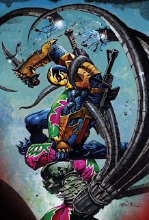
8. Deathstroke #3, by Simon Bisley
I'm not a huge fan of Deathstroke's redesign, or even Deathstroke himself, but Simon Bisley has been killing it on these covers. They're all great, but the bright colors and the awesome, dynamic pose on this one pushes it to the head of the pack. It's the sort of cover I can easily see drawing in a new reader and getting them to give the book a chance. Going by the solicits, this seems like it might even be the start of a new storyline, making this cover even more perfectly placed. Sadly, Bisley's not doing Deathstroke's interiors, but the preview pages from Joe Bennett and Art Thibert look solid, and shouldn't disappoint those who do pick up this comic on the cover alone. I'm not very familiar with the book's writer, Kyle Higgins, but here's hoping he can sell me on Deathstroke as much as this cover is.
7. Batwoman #2, by JH Williams III
Batwoman's spent most of her superhero career being drawn by JH Williams III, which means almost every piece of art associated with her is stunning. Making a Batwoman cover that stands out among many so other beautiful Batwoman covers is a feat in itself, and it's one this cover pulls off flawlessly. A lot of her Detective Comics covers used this same split effect, and it's always effective. I especially love the bleeding colors of the bat symbol and the little details of the fish swimming around the skeleton. The water motif also fits perfectly with the preview pages I've seen, which involve a waterlogged ghost known "The Weeping Woman". Because Batwoman was held back for the relaunch, I actually saw this cover for the first time more than half a year ago. It's still just as stunning, and I can't wait to see it in person.
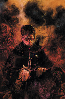
6. The Shade #1, by Tony Harris
James Robinson's The Shade mini was one of the biggest surprises of the relaunch, or at least it was for me. The announcement of series beyond the original 52 was a bit of a game changer, and the incredibly line-up of artists this boasted (Cully Hamner, Darwyn Cooke, and Frazer Irving, just to name a few) didn't hurt. This issue will come out in October, and I can't imagine a more perfect cover for the month of Halloween. This cover is simple enough at first glance, but there's so much detail that I keep coming back to look at it over again. Sometimes I see a great cover solicited and then wince a little, knowing that some of the detail that makes it great will be obscured once the logo is added, but this seems specifically designed to counteract that. Here's hoping that the finished product remains every bit as wonderful to look at. I'm really looking forward at seeing this series' future covers.
5. Wonder Woman #3, by Cliff Chiang
I'm a huge fan of Cliff Chiang's art, but I hadn't really been sold by the covers that preceded this one. They looked great, in spite of the pants/no pants shenanigans, but nothing was sucking me in and telling me that this was a comic I wanted to read until this cover. It perfectly backs up Azzarello's claims that his Wonder Woman will be a "horror comic", and it's just a stunning image all on its own. I'm not a fan of the Wonder Woman logo, and it's a shame that the visual impact of this cover will be dampened a little bit by having that atop it. Still, I think that this is a strong enough cover to overcome a tacky looking logo, and I hope it gets some readers to give Wonder Woman a chance. If nothing else, a cover in which Wonder Woman's costume isn't up for discussion is a welcome break.
4. Frankenstein: Agent of S.H.A.D.E. #3, by J.G. Jones
I love Grant Morrison's Seven Soldiers, think Lemire's Flashpoint Frankenstein tie-in is pretty great, and was generally looking forward to reading this. Seeing this cover, however, pushed this series from "should be awesome" to "OH MY GOD I MUST READ THIS NOW" in my mind. It sells Frankenstein as the DC universe's answer to Hellboy and B.R.P.D., and it sells it pretty darn well. J.G. Jones has been doing a lot of great covers for the DC relaunch, but I think this is his best work hands down. There's just so much going on in this cover without it feeling cluttered or over the top, and I think the blue is really going to look nice when the issue's on comic shop shelves. Thanks to Sweet Tooth and his run on Superboy, Lemire's mostly proven himself to me, and I have faith he can live up to all the awesomeness that this cover promises.
3. Animal Man #1, by Travel Foreman
For whatever reason, covers that are predominately yellow are considered to be a poor choice in the publishing business. Marketing research says that they tend to sell poorly when compared to covers of other colors, and as thus, you don't see a lot of bright yellow in comic book covers. Maybe it's because of that that a cover with as much yellow as this one has pops so much. The insane detail levels of Travel Foreman's art don't hurt. I really like how much about Animal Man you can get just by looking at the cover. You get The Red and his connection to it. You get a feeling for his powers, and you get the feeling that this book is maybe a little creepy and not your standard superhero book. The only thing it's really missing is his family. I hope this cover defies the commonly accepted wisdom about yellow covers and sells a lot of readers on Animal Man, because I really think they're in for a treat if they give it a chance.
2. The Flash #3, by Francis Manapul
Francis Manapul's beautiful Flash interiors had me completely sold on this comic from the moment I saw them, but I was disappointed that his covers weren't really showing off what he could do. Then this was solicited. This actually isn't the issue's final cover, but it's so striking and seems so destined to become an iconic Flash image that I couldn't help but put it on this list. Not only does it completely sell the concept of a speed-powered superhero to new readers, but it showcases everything wonderful about Manapul's art. Even the use of negative space on this cover is perfect, and I really hope it doesn't go through too many changes before it hits stands. This issue is actually going to feature two different variant covers, but I can't imagine anyone wanting to buy them when the real deal looks this good.
1. Men of War #2, by Viktor Kalvachev
I frequently struggle with the top rankings of lists like these, but this was effortless. For me, this is hands down the best cover of the new 52. With one image, Men of War went from being "Call of Duty: The Comic" to being a modern day version of The Odyssey. Taken by itself, this cover is absolutely gorgeous, but in context, it's a complete game changer. Military versus metahumans is the kind of concept I've been wanting to see in comics for a long time, and this cover put Men of War on the map for me. Viktor Kalvachev's work here is the reason this is one of my most anticipated comics. I can easily see this image catching the eye of someone who'd never even consider reading DC or Marvel normally, and that's incredibly exciting to me. All of Men of War's covers have been wonderful, but this one is truly something special.


2 comments:
Great list. I love Greg Capullo and I'm glad to see him finally get out from under Todd McFarlane's shadow
Have you had a chance to see any of his preview pages yet? There are a couple that are really great. I love the way he draws Batman. Not crazy about some of the villain redesigns, but knowing Snyder, there's more to that than meets the eye.
I can always do a preview pages post if you haven't seen them yet.
Post a Comment